Problem
Vendor teams are constantly answering security questionnaires, often under pressure from sales cycles and enterprise buyers.
Over time, they began asking:
“Are we getting faster? Are we repeating ourselves? Is HyperComply actually helping?“
They had no visibility into how much time they were spending, what security topics came up most often, or whether their answers were getting reused. Without these insights, it was hard to improve workflows, demonstrate impact, or build internal trust in the tool.
How do we help vendors understand the efficiency of their time on the app and see how its improving their process over time?

Users
We designed this for Internal stakeholders (like security leads and platform admins) who needed to understand team efficiency and usage trends.
These users didn’t want vanity metrics, they wanted meaningful signals that could help them improve their workflow and tell a story of progress.
My Role
I owned the end-to-end design of the dashboard, from early discovery through to final UI. I worked with our PM, CTO, and engineer to:
- Prioritize the most valuable metrics for vendor users
- Visualize trends in AI accuracy and answer reuse
- Design for varying levels of data maturity (e.g., users with 1 vs. 100 questionnaires)
- Write explanatory UX copy for nuanced data points
Solution
We delivered a clear, digestible dashboard that helped vendor teams:
- Understand their most common question types
- Track how AI suggestions were being used and improved
- Quantify hours saved via automation
- Became a key differentiator during onboarding calls with new vendor customers
- Set the foundation for deeper reporting features across the platform

Surfacing Insight from Unstructured Work
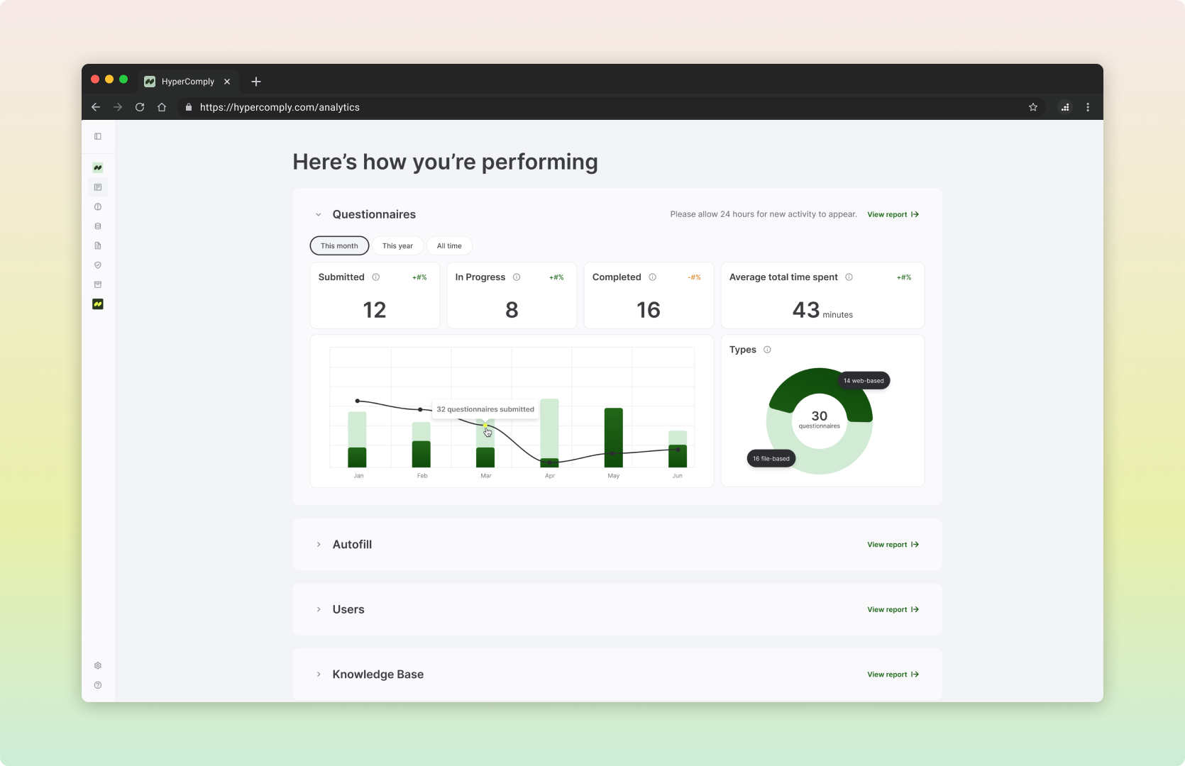
- Common security themes: I visualized the most frequently asked security questions across all completed questionnaires (e.g., encryption, access controls). This gave teams a quick view of where they were spending the most effort and where they could preemptively improve documentation.
- Time and workload tracking: I defined key metrics to help teams see how AI was improving their workflow. We showed how time spent on questionnaires decreased over time as the AI learned from past answers, with supporting metrics like autofill approval rate (a proxy for accuracy) and exact match rate (highlighting repeat questions).
Collaboration
I worked with:
- Our CTO and product manager, to align on how AI usage and confidence could be meaningfully visualized
- Our engineer, to scope what we could infer from questionnaire logs and action events
- Feedback from real teams, who helped us distinguish between “interesting” vs “actionable” analytics
Reflection and Next Steps
Initial reaction to the design has been positive and welcomed.
By showing vendor teams where their time was going and how automation was helping, we gave them a narrative they could share with leadership, and a path toward smarter workflows.
Good analytics isn’t just about data, it’s about clarity. This project brought to the surface some UX issues that prevented us from displaying complete information. We were able to prioritize these and incorporate them into the roadmap.