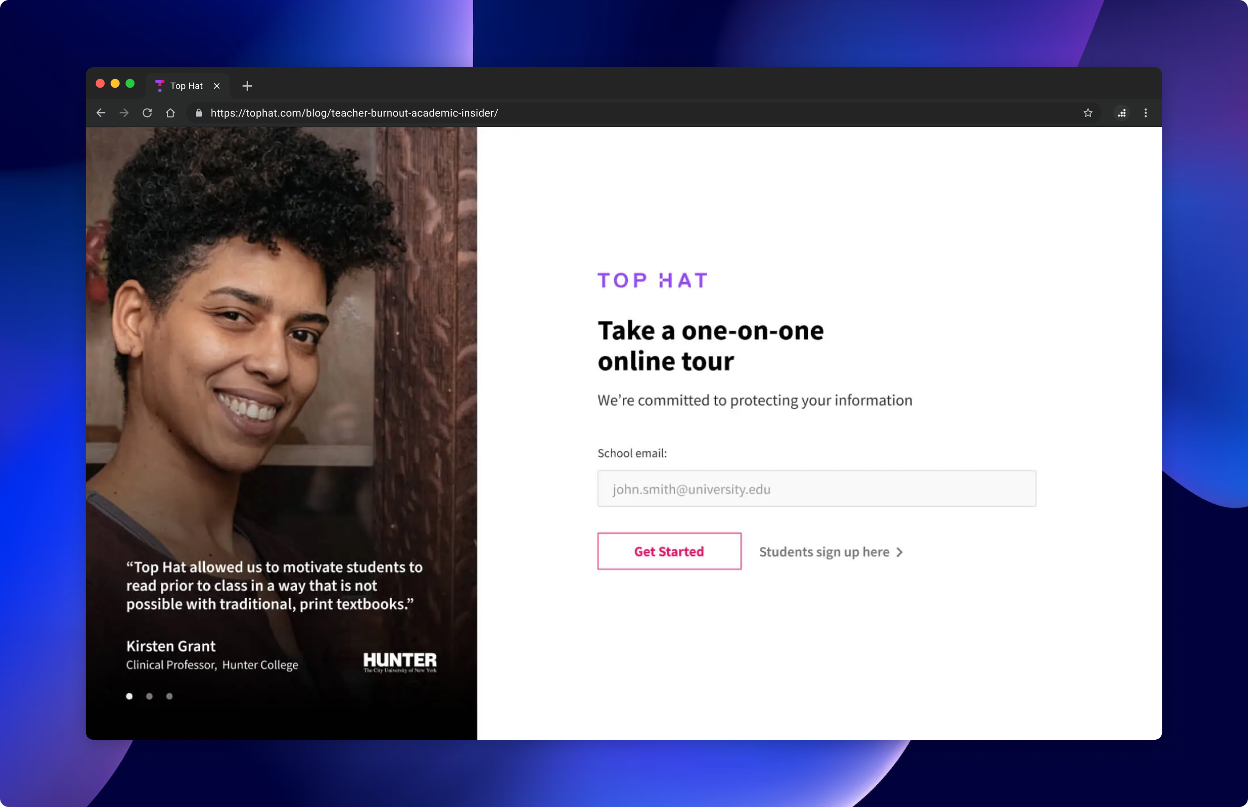
Problem to solve
With increased site traffic approaching, marketing and revenue teams wanted to boost leads compared to the previous year. To address this, we aimed to create a small-scale experiment with a quick turnaround to evaluate and implement results before the anticipated traffic surge.
We took a look at the demo request flow. The original conversion rate was 2.19%. How could we improve this rate?
Process
Determine Scope
Users request a demo in 2 ways: through a demo request pop-up or a form landing page. The landing page was the most popular way of signing up on the website. So, we concentrated our efforts there.
Formulate A Hypothesis
“If we separate the form into 2 steps and completely isolate the flow, the number of form fills will increase.”
Design and Develop
Social proof was added to increase trust. The header and footer were completely removed to prevent any distraction. Form field states were added for clear feedback and the Student button was made more obvious to redirect unqualified leads to the proper flow.

Test and Evaluate
We used Optimizely to run this test. We tracked the “Partial form fill rate” and “Complete form fill rate”.
The old design’s rate was 2.19%
The new design’s partial form fill rate was 29.46% and complete form fill rate was 16.21%.
The new design was declared the winner.
Timeline and contribution
The experiment ran for 1 month. I co-led the Conversion Rate Optimization team along with the performance marketing manager. We scoped the experiment together, evaluated the results, and mainlined the winning variant. I designed the flow, developed it, set up the experiment and tested the set up. The project was reviewed and approved by my manager and the VP of Demand Generation.
Check out the live version here.
(Current state may no longer reflect designs)
