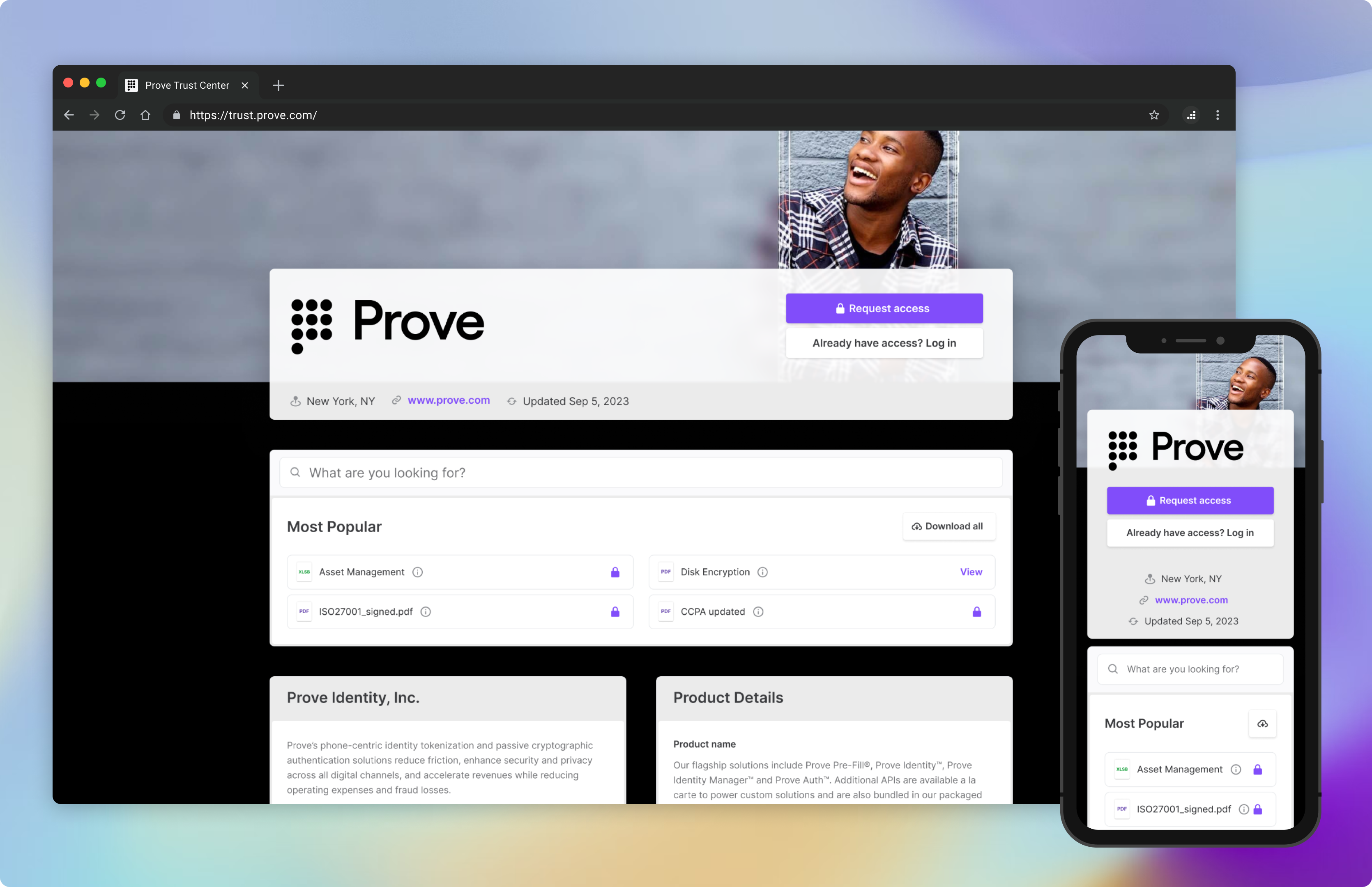
Problem to solve
Our sales reps claim that the competitive advantages of our Trust Pages are that they are an all-in-one solution, have a quick setup, and have a visually appealing design. However, the current design falls short compared to our competitors. As a result, prospects end up disagreeing and losing confidence in our offering.
What improvements can be made to address our Trust Page’s lacking design without compromising on its current capabilities?

Solution
I familiarized myself with our competitors’ pages and compared them with ours side-by-side. I then analyzed the UI issues in our page design, concluded the improvements needed, and began exploring different layouts before landing on one that stood out from the treatments.

Timeline and contribution
The design phase took 2-3 weeks of sporadic work. I worked with the product manager to share designs with internal stakeholders, then they shared designs with a few customers for high-level reactions. There was an overwhelmingly positive response to the new designs and they are in the process of being implemented now.

Retrospective and next steps
What made this project successful was the type of changes that were applied. They were different enough to show a clear improvement in the layout yet were very easy to implement (they are exclusively front-end changes, mostly related to spacing and font treatment). I regularly meet with the developer during its build to make sure the designs are translated well and we will monitor the publish rate and engagement once launched. We will also touch base with sales reps to track any changes to customer responses when being introduced to the new template.
